abo_giftabo_onlineabo_printabo_studentabo_testangle_leftangle_rightangle_right_filledarrow_big_downarrow_big_down_filledarrow_big_leftarrow_big_left_filledarrow_big_rightarrow_big_right_filledarrow_big_uparrow_big_up_filledarrow_dropdown_downarrow_dropdown_uparrow_small_leftarrow_small_left_filledarrow_small_rightarrow_small_right_filledarrow_stage_leftarrow_stage_left_filledarrow_stage_rightarrow_stage_right_filledcaret_downcaret_upcloseclose_thinclose_thin_filledcontactdownload_thickdownload_thick_filleddownload_thindownload_thin_filledebookeditelement_headlineelement_labelelement_relatedcontentlockmailminuspagepage_filledpagespages_filledphoneplusprintprint_filledquotationmarks_leftquotationmarks_rightsearchsendshareshare_filledshoppingcart_bigshoppingcart_big_filledshoppingcart_headershoppingcart_smallshoppingcart_small_filledsocial_facebooksocial_linkedinsocial_pinterest social_xsocial_xingsocial_youtubesocial_twitteruser_biguser_small

Notes for Book Authors

Your idea for a book in experienced hands

At Ernst & Sohn GmbH, your specialist publisher for civil engineers and architects, we have been publishing and marketing your knowledge, experience and your new findings since 1851!

The brand Ernst & Sohn has a high recognition factor in the market and stands for:

  • Concept development with construction engineering specialists in our in-house editorial department,
  • Quality assurance and professional support by the publisher's staff,
  • Classic proof reading and computer-based composition,
  • Diverse propagation of the publications, printed and electronic,
  • Global networking of marketing and sales with Wiley, one of the largest scientific publishers in the world,
  • Contact partners in Berlin, short communication routes, regular discussions about each project.

From manuscript to book

The notes for authors given here have been developed to enable rapid book production. The appropriately prepared manuscript can also be processed for electronic products and published in various formats.

Production sequence and proof correction

After you have handed in your final manuscript completely in terms of word files, figures and tables, we undertake technical and structural checking of the document. Then the manuscript is typeset and you receive your proof as PDF for correction and approval. In the case of questions or uncertainties, you will be contacted by your project manager. If there are no further problems, we proceed with production.

Now your manuscript is prepared for the standardised XML production, copy edited and typeset according to our standard layout. At this time, you will receive a rough schedule as an overview; you will also be sent a notification from the typesetting company with a date when your correction printouts will be available for correction and approval. You receive the page layout as a PDF file for correction of any setting errors and to check for completeness.

Questions arising from the copy editing are shown in the PDF file. In your author corrections, please avoid extensive text additions or deletions, which could considerably alter the page layout. Please do not make any changes to picture or table locations unless this is necessary from the content.

Correcting in the Adobe PDF

Correction should be marked in the PDF using the tools listed below. This eliminates errors due to poor scans or unreadable handwriting.

Markierungswerkzeuge

  1. Delete text
  2. Replace text
  3. Add text

By activating the menu "Comment" these options can be found:

Kommentieren-Menü aktivieren

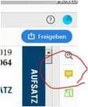
Enter any desired changes to the picture arrangement or such in the Comment bubble:

Kommentarblase

Please note:
If a picture has to be replaced, please send this to the publisher in the best possible resolution (by email or data transfer).
Users of the full version: Please do not change or format the PDF yourself! Only PDFs with comments are suitable for correction in the setting company.

Layout vs. Structure

Layout

The layout is determined by the publisher. Starting with the height and width of the type area, the design of the headings, the font, and the defined picture widths and layout of the tables: all these are shown in the layout and in our sample layout. The sample layout is used for books with the dimensions 170 (W) x 244 (H) mm and shows the layout most frequently used by Ernst & Sohn.

Structure

To give the text structure means to create a consistent breakdown of the text and a clear heading hierarchy. Furthermore, pictures, equations, tables and references are numbered and referenced in the text. In this way, elements can be unambiguously linked, which makes an electronic product user-friendly.

Sample layout

View the sample layout here.

Mathematical formulas and special symbols

Formula characters and other symbols must be consistent in the text, pictures and tables. They are to be created clearly and distinctively with a text processing system (e.g. with a formula editor). Symbols and formula characters should generally be written in italic in font "Times New Roman". For the division of thousands, points are used from the fifth place, e.g.: 12.500,50 m.

Indices and exponents are to be denoted with clear subscript and superscript placing and should not be formatted in italics. Numbers are generally not shown in italics.
Formula characters should be used in accordance with the relevant standards. In the notation, particular attention should be paid to avoiding the danger of confusing greek, roman, latin and arabic characters as normal letters or capitals (e.g. (e.g. γ, y and ϒ, ο, O and 0 (zero), ω, w and W, arabic 1 and small letter l). Fraktur letters are replaced with semi-bold printed characters, and three-stage expressions are to be avoided if possible.

Formulas are generally written in italic:

  • Variables, z.B.:
  • Functions, z.B.: f(x)
  • Physical constants, z.B.:
  • Indices, which are variables or physical quantities. e.g.:

Written in superscript are:

  • Functions with fixed names, e.g.: or
  • Mathematical constants, e.g.:  or
  • Units and their prefixes, e.g.: d =
  • Indices, which stand for a name or descriptor, e.g.: or
  • Chemical elemtens or particles, e.g.:
  • Mathematical operator, e.g.: AT =
References according to ISO 690

References are generally given in the style "Vancouver", i.e. continuous numbering in square brackets, starting with the first mention of a source in the text as [1], independent of alphabetic order. At the end of each chapter, the references used in the chapter are listed in the order [1] to [x]. This can lead to the same reference being listed in different chapters with different numbers. Background: when a single chapter is purchased in the online shop, the complete chapter including references is obtained.

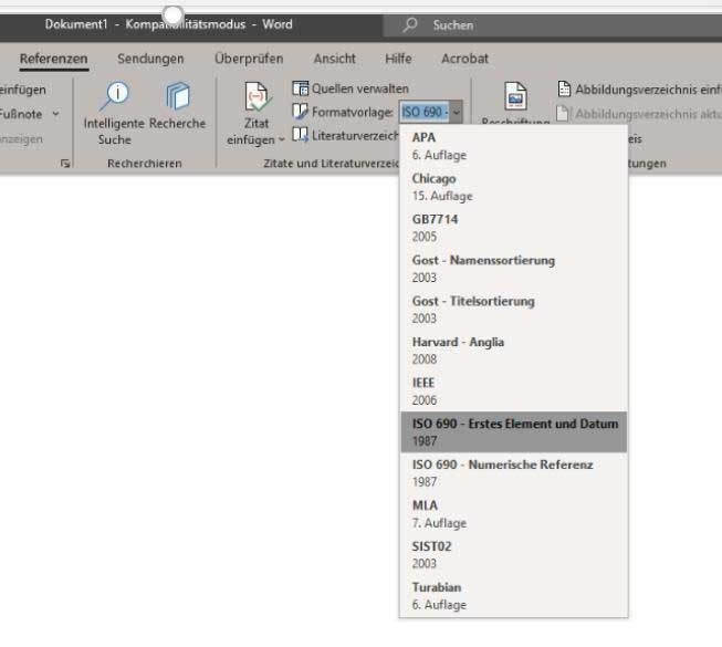
In Word, the citing method if configured according to "ISO 690 – first element and date" as follows:

Tab "References" → Style sheet → select "ISO 690 –first element and date" from the drop-down menu
(sample screen shot)

Formatvorlage 

ISO 690 - erstes Element und Datum
A collection of examples for the method of citing various sources is available for download. The reference administration tool Citavi offers you a style for Ernst & Sohn citing.

Creating an index in Word

Reference books have an index. The relevant keywords are selected by the author and tagged in the text before handing in the manuscript to the editorial office.

Instructions by Microsoft on how to mark-up an index in Word

What is XML?

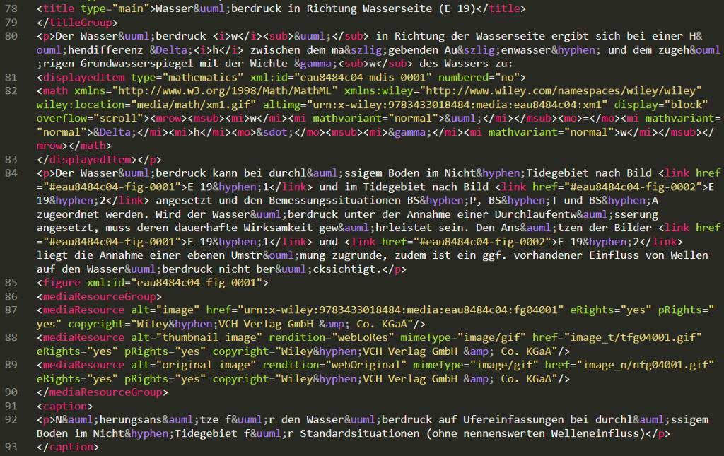
“XML” stand for Extensible Markup Language and contains the marking and thus structuring of content according to rules, which can then be repeated in a layout or processed differently in various media – from printed product, through a structured PDF, to use in a database. Translation into XML, that is the tagging of the content, is carried out during production. This is an example:

Übersetzen in XML

The advantages of XML:
•    Unambiguous structure
•    Quality assurance: all elements and links to pictures, tables, equations and references are complete and correct.
•    Electronic versions appear before the print version.
•    Media-neutral production – use in print media, e-book readers, databases etc.
•    Archive with a secure future
•    Quicker production of new editions based on the data of the previous edition

Graphics - our preferred font

When you create new graphics, please use the open, serif-less font Stix-Two – our standard font for text in pictures.

You can obtain the font here as a download.